   |
|
weblog
October 26, 2004 Being Josh Rubin. A bit of window shopping over the weekend had me stumble into CP Company's and Stone Island's showroom in Milano. Both sister brands are well known for their impressive R&D investments, especially when it comes to exotic fabrics: unless it's resin-coated moleskin, rubberized nylon linen or Teflon-coated cotton it's unlikely to find its way onto one of their products. Both also focus on sports/work-ware polished to a fashionable sheen. One of Stone Island's latest cross-pollinations is the 9U82 shoe, co-designed with leading Italian climbing footwear manufacturer La Sportiva. Stone Island is hardly the first to pimp climbing footwear (Puma had jumped the gun earlier in the year with the Klim) but they have really gone off the deep-end with the 9U82. 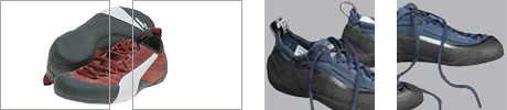
Left: Puma's Klims. Right: Stone Island's 9U82s. Torqued by over-specialization climbing shoes have evolved in the past years from mere footwear to veritable tools for climbers' feet, with results that tend to resemble rubber-soled leather bananas, at least when not worn. Sport climbing shoes are specifically conceived to counterbalance the human foot's weaknesses in (vertical) environments it wasn't originally designed to tackle. Rigid soles are not an option if sensibility is paramount, thus tension replaces thickness, the foot bent and twisted in hypernatural ways to increase overall stiffness and load-bearing resistance. Think of it as pre-compression for the feet, with comfort sacrificed on fitness to task's altar. I admit not having tried the strongly asymmetrical 9U82s, but I surely hope the clones are not as brutally uncomfortable as the originals, which usually feel like really thin, really sticky leather casts. What is maybe puzzling is that there's very little re-interpretation of the reference design here , but rather its sheer adoption, albeit with a few minor twists (or lack of thereof). I am also left wondering if the unreasonably steep price tag should as well be interpreted as fashion's (dubious) homage to the shoe's heritage. Posted by fabio sergio | 11:06 AM | permalink ............ October 21, 2004 The context of context in use. Accommodating the needs of different users at the same time, or even of the same user at different times for that manner, is still one of the most undervalued aspects of interactive products. A few tricks aimed to power users have become pretty common, like keyboard shortcuts on PCs and long key presses on mobile phones, but we're still far from interfaces that adjust to our ever-changing needs. I am not talking about true design for adaptivity, and definitely not about Microsoft's frequency-of-usage-based menus, only about simple ways of letting people choose the level of cognitive involvement they're willing to accept when using an interactive artifact. As connected tools keep absorbing features and functions from PCs, cameras, MP3 and video players their text-based menu structures have developed a bad case of interface obesity. My current cameraphone kindly offers to send, delete, rename, multiple delete, delete all, get file info and get memory info when I look at my photos, and that is just for the left soft-key. I'd be tempted to bet that send (to keep operators happy) and delete (to keep users happy) would be more than enough options for the proverbial 80% of the user population. I haven't used ICQ for ages, but I can still remember the surprise of getting offered to use a "basic" interface or an "advanced" one. Choosing "basic" did a very simple thing, it hid what most users were likely not to use most of the time. Crude? Yes. Effective? You bet. Hail the power of perceived simplicity: why shouldn't all mobile phones give users the ability to choose a "basic" profile? We need connected devices that actually do more by doing less, by keeping things simple for people who do not want to deal with unnecessary complexity. All of the above came to mind lately as LG Telecom is marketing the NS 1000 touting its virtues for older users, because of low price, bigger keys and limited functionality (talk and text only). Others have rightly pointed to the phone's many shortcomings, but I agree there's definitely the need for more attention towards user groups with specific needs, older users likely being at the very top of the list. Don't get me wrong now, I am not one who underestimates the abilities of this often mythical user group. How many times have you heard the phrase "my mother/father would never use this", or similar expressions? I've come to believe that such preconceptions need to be seriously re-examined. My father, who is now nearing his 70s, has spent the past week successfully setting up a power-line home LAN. How many "elderly people" like my father are out there, for I am sure that's how marketing types would have him categorized? As Adam Greenfield has recently stated we need more realistic use cases, so there's definitely the need to have conferences like Aging by Design to subtract stereotypes from the equation and move from early adopters to elderly adapters. The truth is that most of the above started out as an excuse to make a few considerations around people, tools and interaction design. Obviously hiding away things is not a recipe for success when it comes to improving usability. I've come to believe that the complex nature of our connected tools not only has to do with archetypally myopic marketing and technically driven decisions, it might also have to do with the interaction design community and with the way we all tend to relate to context of use. Usability measurements are only possible given a specific environment that enables to frame the right questions and evaluate the answers, but I am afraid that we often consider context of use as something that surrounds people, when it is actually what users bring with them in terms of mental models, physical abilities and personal dispositions. In other words: a flight of stairs is a totally different context of use for somebody who can see and for somebody who cannot. I know I am not the only one and not the first who's saying it, but time is ripe for devices that provide bundled packages tailored to the specific needs of specific user groups. We need applications like Mobile Magnifier for those lacking 20/20 vision, or phones that enable lip-reading for the hearing impaired. The likely side-effect is that in the end people who'll benefit from these improvements will not only be those specifically targeted, but a much wider user base. It happened with wheelchair ramps, who made life simpler and better for anybody pushing baby strollers, for example. Further extending the concept I have in the past advocated for mobile phone user profiles that act not "from the outside in" (outdoor, silent), but "from the inside out" (hearing impaired, willing to help), silently beaming metadata that will alert people and objects around us about our limits, inclinations and dispositions. User profiles that will help create the context of use that suits our needs and desires. Thomas Vander Wal's Personal Info Cloud definitely comes to mind. It is about time that we start to relate to the interface not anymore as the layer between us and our devices, but between us and the world surrounding us, both the world of space/time and the world of relationships. Posted by fabio sergio | 6:31 PM | permalink ............ October 20, 2004 The sound of the one book. Satori while leafing through Michael Freeman's Japanese Design Solutions. A minuscule house in Kyoto, an elderly couple, their collection of books too large to be exhibited in the limited available space. Western architects would have impressed their clients with ingenious space-saving stratagems, but not Japanese architect Jun Tamaki. 
A niche, a niche for just one book, the most treasured of them all. A single book to evoke, alone, the entire collection, stored elsewhere. Verbalizing how emotionally powerful this is to me would be pointless. There's something at work here. I hope you feel it too. Posted by fabio sergio | 2:34 PM | permalink ............ October 19, 2004 Metamorphing. Valeria's birthday present this year was a week-end in Venice visiting Metamorph, the 9th international architecture exhibition at the Biennale. My previous stays in Venezia had lacked the archetypal romantic mystique associated with the city embraced by water. Thanks to Vale the spell was broken. Venice competes daily with its own myth, and it does so with the dignified grace of a fallen noble, nighttime wonders making up for the humid decay that daylight reveals (then again others would probably argue that it's that very decay that adds to the city's enigmatic appeal). Metamorph was stimulating, but somewhat failed to meet my expectations. I found the exhibition's much-criticized layout, courtesy of Hani Rashid and Lise Anne Couture of Asymptote fame, unobtrusively effective. The exhibition designer conundrum: making a statement that adds to the overall discourse, rather than just increasing noise. In this sense I believe Asymptote succeeded, their flowing white stands and subdued lighting lending a sacral aura to the decadent proto-industrialism of the Corderie dell'Arsenale. It almost felt as if a giant whale had previously laid in place of the models crowding the long sequence of brick-walled warehouses. 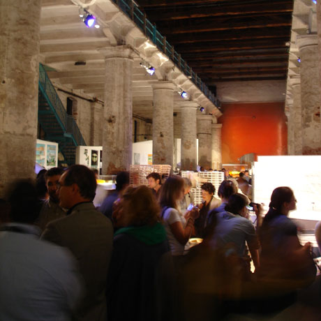
When it comes to the gift rather than the wrapping the most obvious limit to an exhibition such as Metamorph probably lies in the format itself. It might sound like a (really) stupid comment but architecture needs to be experienced, the marvelous play of the volumes under the light as somebody used to say. Photos and lusciously detailed maquettes can only offer glimpses into the true emotional power of space harnessed into locus by the vision of man. That said the extensive selection of contemporary projects made for a very effective cross-section of forces and ideas shaping architecture today. To draw an odd parallel Metamorph resonated with Bruce Sterling's speech at SigGraph, "When Blobjects Rule the Earth" (maybe not so odd as the term "blobject" was coined by Karim Rashid, Hani's design rock star brother). The selected works displayed at the Biennale showed that the latest software tools are empowering architects like Peter Eisenman and the ubiquitous Frank Ghery to soften the laws that modern architecture managed to wrangle out of its heritage. Form has become malleable. And that's when things can get a bit messy. A disclaimer first. Both of our eyes point forward, so that we stare ahead, to the future, and I am no exception to the rule. What follows is thus not a "days of yore were golden" rant, but rather an argument around the value of limits. I'll let James Alen's poem on constraints (as recently provided by Peter Lindberg) set the mood: Every task involves constraint, Solve the thing without complaint; There are magic links and chains Forged to loose our rigid brains. Structures, structures, though they bind, Strangely liberate the mind. In my very personal view architecture and design are all about creating an honest dialogue with existing constraints. Without limits architecture and design quickly cross fuzzy boundaries into art's realm. There is nothing wrong with that, mind you, but I would never want to live or work in anybody's Scream. As Bruno Munari said "The biggest hindrance to understanding a work of art is wanting to understand". Architecture simply cannot afford to be so dismissive of rational and emotional comprehension, as it arguably exists to be used and lived in. My personal definition of great architecture: a compelling story turned solid. A story that you don't understand won't keep you awake long enough to hear it. Without disturbing Vitruvius there are implicit hierarchies of constraints when it comes to architecture, from material to function to (socio-topological) context, with esthetics and economics informing directions and decisions. Metamorph was ripe with projects that transcended all three levels, shedding constraints like an old skin and leaving formal composition alone to justify the results. Glass amoebas dropped into hard-edged casts, poked by unwieldy urban geometries to the point of deflation. Contrast has always had a place in the history of modern architecture (think Centre Pompideau), but the gratuitousness of certain executions betrayed the architect's own original gesto, a single all-encompassing creative act, rather than telling a story about relationships (or lack of thereof). A story about the architect's own language, if you will. 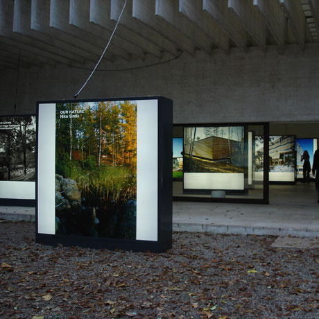
There are also other algorithms to decode my critical take on quite a few of the projects exhibited at Metamorph, and I'll quickly point to three of them. Adaptivity. Dan Hill has recently touched upon this theme with cunning considerations on Frank Ghery's Stata Center at MIT Boston. What are the true metamorphic qualities of contemporary blobuildings over time? Will they be able to learn as easily as their less flamboyant predecessors? Sustainability. An often untold side-effect of many hyper-organic buildings is that they defy structural standardization: each joint and surface has to be designed, produced and assembled, each load calculated on its own. Needless to say such one-off-ness drives costs upwards (and makes art quickly come to mind again). Visual addiction. Metamorph could easily foster reflections on unrealistically striking graphic representations, architecture that's meant to be looked at on paper, not necessarily built, architecture that un-gracefully degrades from immanence to permanence. Others have already verbalized this concern better than I could, so I'll simply add that I greatly enjoy fiction, but I am bothered when it's communicated as history. I also wonder if this is all just a side effect of our eye-obsessed culture, or the result of the lure of seemingly omnipotent bit-powered drafting tables, tools sometimes used immaturely for the sake of novelty. Enough ranting, don't you think? The solipsistic nature of a one-man conversation easily induces hypercriticism. To minimize said effect I'll close by pointing to a few of the exhibition's many seductive projects. My favorite one has to be Makoto Sei Watanabe's Shin Minamata Station. Based on the principle of "architecture as state" the station's metallic skin is both a dynamically poetic statement about pausing time's perpetual flow and a creatively successful attempt at solving functional problems, configurations tested iteratively to provide protection from the elements and optimize visual correlations between the building an its surroundings (internal transparency vs. outer opacity). Material, function, context, esthetics. Balance. Beauty. Partially contradicting myself I'll also list Peter Eisenman's Ciudad de Cultura de Galicia in Santiago de Compostela, from the Topology section, as one of my faves at Metamorph. I am hardly a lover of Eisenman's but I'll gladly make an exception for this stunning re-assembly of an entire hill (even though the inside looks like one of his typical wayfinding deliria). Plot's Concert House in Stavanger, Norway, is also a grand statement about the role of the topology in shaping cultural practices, its two permeable volumes hinged to create an open air seating area, the sea lending a majestic backdrop. Assorted honorable mentions: Ren� Van Zuuk's ARCAM building in Amsterdam, and Bernard Tschumi's Vacheron Constantin Headquarters, for their flowing metallic veils, elegantly draped over glass volumes; Toyo Ito's Tod's Omotesando Building and Claesson-Koivisto-Rune's Sfera Building, for the sheer poetic qualities of their semi-transparent, patterned shells. I'd love to waste even more useless words on the various national pavilions (especially Denmark's alliance with Bruce Mau and Japan's celebration of Otaku culture), but this entry is already too long for its own good. This is its end. Posted by fabio sergio | 8:30 AM | permalink ............ October 13, 2004 Design Engaged. I am counting the days to Design Engaged. It'll be great to see many friends and, in a few cases, to finally meet them face to face. Chapeau Andrew for making it all possible. Here's what I'll likely ramble about/around: "From Collision To Convergence" (Or how I learned to stop worrying and watch TV on my mobile phone) Just as Portable Media Players are getting ready to flood the market, bit-based video streams seep into the liquid crystal displays of our mobile devices. Scattered findings from a born-again viewer playing auto-ethnographer. Posted by fabio sergio | 7:19 PM | permalink ............ October 08, 2004 Toys for grown-up children. 
Robo Garage, RoughToyz, STRANGEco. Posted by fabio sergio | 8:30 PM | permalink Overfocus. The end of my car commuting days has translated into newfound time to read on the metro. 40 minutes each way, about 1.5 books a week, give or take a few magazines squeezed in for good measure. Just enough to keep my dendrites buzzing. These days I am going through Marc Twight's "Kiss or Kill: Confessions of a Serial Climber". Beyond the repulsive title lies an intriguing account of mixed-climbing feats, up ice-plastered mountain faces, whatever the season, ice tools in hand. Twight is one of those alpinists who pushed himself well beyond his limits for years, and he's probably still recovering from the surprise of having survived his own appetite for pain. There's no going around the fact that if you ride the razor long enough you're likely to get halved. People like Twight know it, and ride anyway, albeit as carefully as they possibly can. Very often it's not enough. What's peculiar about Twight's writing though, is that he succeeded in upsetting the mountaineering community on both sides of the ocean, negating the whole 1800's "man against nature" aura, the "I climb mountains because they are there" mystique. Twight pits man purely against himself, under death's scrutinizing eye. To him climbing is not a pleasure but an addiction, driven by the need to obliterate ego through life-threatening action. Nature has faded to the background, it has become just a means to an end. "I do it because I can.", in Twight's own words. A good epitaph for modern man, if you ask me. Punk-rock-tinged Nietzschean overman, Twight comes through as who he probably is, a man chased by his obsessions, who ruthlessly severed any tie preventing him from getting his fix, love and affection left in the wake of his unquenchable thirst. He tells his tale twisting his guts and lets readers peek at the blood glistening in the gutter. Being who I am, in medio stat virtus, I stand stunned, finding such single-minded, seemingly senseless focus absolutely fascinating. To counterbalance: Patrick Berhault's "Legato Ma Libero" (available in French and Italian only, sorry). The diary of an east-to-west climbabout of the Alps from a man who considered them his playroom. To extend: Tucker Viemeister's "Emotional (vs.) Intelligence". If you like odd comparisons read it in light of considerations above (no, not another Norman-esque take on Emotion and Design). Posted by fabio sergio | 8:00 PM | permalink ............ October 07, 2004 Anatomy of a well-formed del.icio.us link. My del.icio.us links have become an integral part of freegorifero's RSS data-stream of consciousness, and I've been thinking about ways to have them follow the same "policies" I try to apply to the rest of the content on these pages. This is what I've mustered so far. The description should include the original "title" of the linked article/post, its source/author ("Wired News:", "AdamGreenfield:") and, if needed, how you got there ("via ..."). In the extended description the excerpts from the linked content should be differentiateted from the comments of the person linking: inserting text within quotation marks should work for the former, omitting them in the latter case. I will steer clear of considerations around tagging, and leave them to bigger brains. An example, to sum things up. Description: TheFeature: Hooked on del.icio.us (via Howard Rheingold) Extended description: "It has that wonderful combination of useful, fascinating, and obsessive-compulsive that has driven the growth of the web." Howard is as insightful as ever. Let's see how that works from now on. Posted by fabio sergio | 3:45 PM | permalink ............ October 06, 2004 We have met Big Brother and he is us. Just as Sir Heathcote decides to make his whereabouts public I can't help but think about Daniel Pink's "Little Brother Is Watching". George Orwell was wrongly right: his ever-present surveillant will simply emerge from our micro-collective (self) voyeurism. Think Deja View Inc. and IMWatching. Chris asks: "Can we get excited yet?" Pink answers: "Be thrilled. Or worried. Or both." I am...er...worriedly excited? My luddite side keeps wishing for technology for forgetting to counter-balance this thirst for documenting. On a related note David Weinberger's "Point. Shoot. Kiss It Good-Bye." cleverly explains why once we have a gazillion digital memories most of them will be simply un-findable, and pretty meaningless as well. I agree with him that Mr. Butterfield and the great people over at Flickr have started beating a promising path: decentralize (unlimited) storage, rely on connectivity for access, create flexible tagging schemes, make it easy to share with others but keep privacy control paramount. Posted by fabio sergio | 8:00 PM | permalink ............ October 01, 2004 Minimal Nouveau. 
Joris Laarman's Heatwave. 
Rowan and Erwan Bouroullec's Algues. 
Front Design's Insect Table. Posted by fabio sergio | 8:00 PM | permalink ............ Not bored yet? Visit freegorifero's weblog archives for more useless words. |
updated with blogger |
|
| © freegorifero.com This web site is licensed under a Creative Commons License. Some rights reserved. |
|